Facebook IPO Analysis
Collection of charts summing up a perspective and Facebook IPO Analysis curating and focusing on all the buzz leading up to the big event, and the controversy proceeding it.
Shares in the social-media giant Facebook (NAS: FB) have been public for more than two weeks now. The bad news is that they’re down more than 35% since opening at $42 on May 18. The good news is that things could have been a lot worse.
Facebook IPO Analysis
Pre IPO Charts
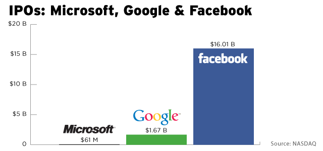
Facebook was the largest tech IPO in history as the company and its early shareholders raise about $16 billion at the final price of $38 a share. Here’s how it compares to other historical IPOs, according to NASDAQ data.
Then here’s how it compares to how much Google and Microsoft each raised in their respective IPOs.

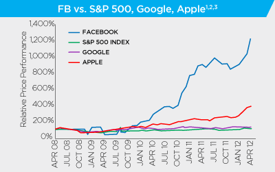
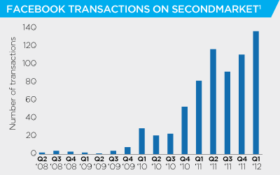
We also have historical price data from SecondMarket , which is a private secondary market that became popular among former Facebook employees who wanted to offload part of their stake in the company. Here’s more data from them :

Facebook has outperformed many of the largest tech companies in the world over last few years. (That’s not totally surprising though since they started from a much lower base.)

Here’s how the number of transactions has scaled up on SecondMarket over the last few years.
All leading to the magical much anticipated moment - The Facebook IPO .
Post IPO Charts
During the day 1 of Facebook’s IPO, some companies such as Datasift tried to predict (or rather justify) facebook stock price by correlating it to Twitter conversations and sentiment.
Nevertheless, it turns out that Facebook debut at Nasdaq, was among the worst big U.S. IPO starts ever .
But after two weeks, the Facebook IPO is just one among many disappointing Internet IPOs – neither the best, nor the worst:
Company | First Day Return | Two-Week Return | Total Aftermarket Return* | Total IPO Return** |
|---|---|---|---|---|
| Bankrate | 10% | 18% | 28% | (7%) |
| 14% | (5%) | 11% | 84% | |
| Yelp | 12% | (1%) | (28%) | 47% |
| **Average** | **(6%)** | **(14%)** | **(28%)** | **49%** |
| (9%) | (34%) | (36%) | 11% | |
| Zillow | (37%) | (52%) | (43%) | 185% |
| Zynga | (14%) | (14%) | (44%) | 10% |
| Pandora | (13%) | (13%) | (47%) | 25% |
| Groupon | (7%) | (12%) | (62%) | 40% |
The worst performer of the lot is Groupon (NAS: GRPN) , which is down 62% since going public last November. Not far behind are game-maker Zynga (NAS: ZNGA) and Internet radio company Pandora Media (NYS: P) , both of which are down nearly 50% after initially launching above their IPO prices.
Some analysts set a 25 target price , some had predicted even a 12 target price, while Forbes predicts Apple wil hit $1,650 by the end of 2015. The most extreme [negative] analysis goes to Eric Jackson, who said “In five to eight years they are going to disappear,” he told the CNBC show Squawk on the Street on Monday.
I, among probably most people, thought the IPO was way overhyped and overpriced, and am happy to see it stabilize, which sends the right message to all other companies in the industry.
What do you think of this short Facebook IPO Analysis? What’s your prediction of the coming months?


