Adobe for iPad - Need to Step up on Experience
 Last month I wrote why Apple doesn’t allow Adobe near the iPhone
. Today, Adobe is trying to get into the iPad … Adobe will roll out new publishing software for tablets. This new software, which will soon take its place in the Creative Suite pantheon, will be downloadable from Adobe Labs and will include tools that bridge the gap between print-oriented InDesign and software for interactive formats.
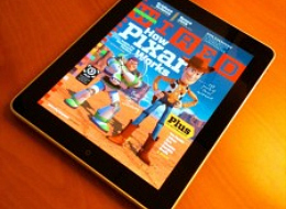
Adobe released a video showcasing the new capabilities, available to watch at Adobe TV and embedded below. You will noticed they added tons of capabilities around content … such switching images, embedding video and rich content … but it’s all about content? What about gesture navigation? what about the experience? For how long will Adobe keep missing the experience aspect that makes Apple, Apple.
The new magazine experience in a tablet is not based on technical capabilities of the tablet, it’s all about providing a richer experience to the user… making it more natural, seamless, human per-se.
Adobe definitely in the right direction … there’s a huge market of publications trying to reinvent themselves and salvage their business, and the tablet is one of the elements that’s a must … Perhaps Adobe is thinking of all these usability issues, but they should really makes a point to let us know… can change orientation? instead of clicking, can you flick those images? can contextually zoom in? Drag and drop bookmarks?
It’s all about the details. Would really love to see Adobe understand it as their produce some of the best design and publishing software in the market … Adobe, you’ve for the tools, content, lifecycle … once you add usability and experience to it, it could be a home-run.